Saturday, 9 January 2016

Review of Editing

Editing the music video for our artist had both strengths, weaknesses and challenges, however, overall, I believe that as a result of this process we have been able to create a successful music video. 
     When we began to edit, we did not have all of the footage, only part of the narrative thread, making it very difficult for us to edit. As a result we had to leave gaps in the sequence so that we could fill them in, making it hard for us to get an idea of what the video would look like. We had used the storyboard as a guidance as to where to place the clips of the narrative which we had taken, however, without all of the footage, we were unable to see if this would actually work or not. 
     We later decided that this narrative footage was not good and so had to start editing again, this time with the other half of the narrative. At this point, we had filmed some of the performance element so we could add this in. We still used the storyboard and shot list as guidance as we still wanted to place the performances in the same place and therefore the use of our planning was very effective. The problem with this was that we had still not yet filmed in the studio and so we still had gaps left in the sequence. 
     While editing we also noticed that some of the words in the performance were not said, making it difficult to match the words to the audio. This was something that we had noticed as well as being told about from our feedback. We were able to work as a team in order to do our best to minimize the times where the lip syncing and audio were out of time, with one person using the keyboard and the other watching the screen to fit the two together. 
     We also noticed that we were able to cut to the beat much more than we had initially thought, which looked more visually appealing that the way in which we initially wanted to cut the footage. Additionally, due to the use of more than one camera in the studio, we were able to cut two different angles together showing the exact same footage. 
     After receiving feedback, we had to change the narrative a few times which meant that we had to rearrange footage on the sequence timeline, however, this was not a problem as we had enough footage to use from the narrative thread we would use to put in the place of what we had removed.
     In some of the clips, there was a lot of grain which when filming was inevitable due to the weather and the times that we were filming, however, we were able to remove this through making the footage darker. We also edited the colouring and added a cinematic style sharpness to the footage as well as a letter box in order to make it more professional looking.
     Overall, I believe that where we had challenges, we were able to overcome these and when there were weaknesses, we were able to change our editing so that we were able to make a good media product to sell our artist. 

Thursday, 7 January 2016

Audience Feedback


We showed our video with our final narrative to a group of students and asked them some questions in order to get feedback.
     In order to see if we had been effective in portraying our narrative, I asked whether they understood the narrative, they said that they did and some were able to expand on this, telling us what they thought it was about. The symposiums that they gave were very close to what we had set out to achieve and therefore, we were able to conclude that they were able to understand the narrative as intended.
     I also asked them what genre they believed this video and our artist would fit into. This was very important for us to do because we needed to see if the way in which we created the star image for an indie artist was effective and whether this was something that could be noticed when watching the video. A couple of people said that they thought that the video was indie-pop and therefore we could conclude that the representation of an indie artist was somewhat clear.
     To understand what we could do to make the video better, whether it be to help the audience understand the narrative or identify that the artist is from the indie genre, we asked the group what they would improve. The group said that we should consider removing the end shot as they were unsure as to why it was necessary. However, when we asked a different group of people they said that they liked it and that we should leave it in. Upon reflection, we have decided to leave it in as we want to create ambiguity as to what the girl is doing in the cafe and who she is waiting for.
     We needed to make sure that our artist gave a convincing performance as this is something that is very important for an indie artist to be able to do. When I posed this question, the group was positive and said that he gave a good performance, making them believe in the song as it was evident that he did too.

Wednesday, 6 January 2016

Response to Feedback and The Final Narrative Concept

After trying out a new narrative concept and and showing the rough cut to a focus group we asked for feedback. Many people in this group said that they were unclear as to what the narrative was and that the fact that the girl was cheating was not obvious. A few people commented on the fact that this was due to the boys looking too similar and that there wasn't enough footage with the girl and the boy who was not the artist. Moreover, from the feedback, it was clear that the new footage we had taken was not as good quality as the footage that we had taken during our first shoot days.
     Later, we discussed what we should do and decided that it would not be feasible to re-film as this would take too long. We would also need to find a different boy who the audience would not think looked too similar to Jay. This would also take a long time as we would have needed to do test-screenings for more cast members. Therefore, as a result, we have decided on a narrative that works with the original footage that we had taken.
     In the video, Jay Harper, the artist, sings about a past relationship where he was happy. He is singing about being happy and being yourself in a relationship, therefore, telling everyone that they 'don't have to wear [their] best fake smile,' and should find something that makes them happy.


Connecting Products

For an artist, logos, fonts and images can become used as a form of identification and as a way to brand products as being from a particular artist. For the audience, this makes the products easily identifiable as they are looking for a particular image or font. This can also be used to link products and promote them.

GEORGE EZRA
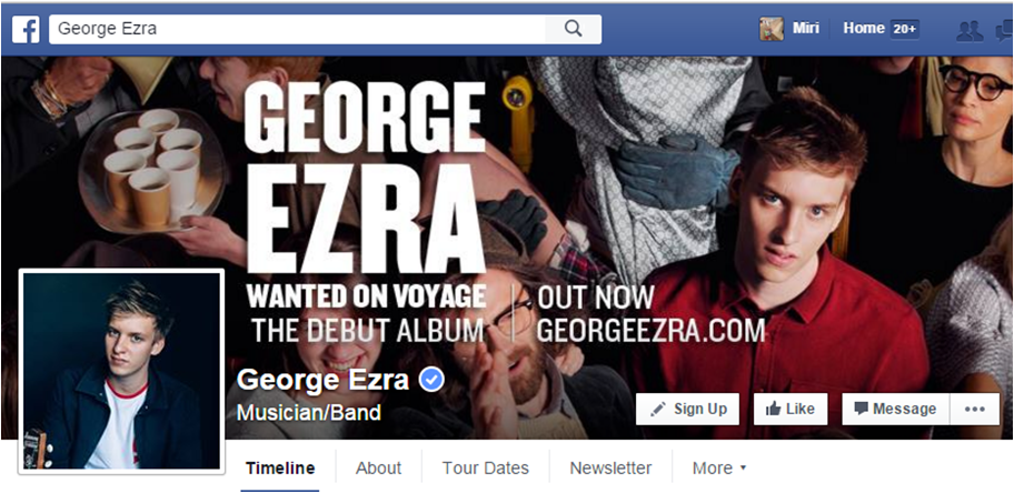
George Ezra's website, digipaks and Facebook all feature the same font which creates a sense of continuity and easy identification for the audience. His Facebook and album digipak also feature the same image which acts as cross-media promotion for the album as well as further helping the identification of the products.
     A member of the audience may see the font and know who the artist is as well as possibly some of their songs and the use of the same image allows the audience to become familiar with that product and what George Ezra looks like, therefore aiding their identification of his products.


THE ROLLING STONES
The Rolling Stones use a logo as their form of identification. This can be done because they have become so famous that they no longer need text to show their band name or an image of their band members for the audience to be able to identify them.
     The same logo is seen on almost all of the merchandise on their website, the homepage of the website as well as on their Facebook page. This re-enforces the fact that the logo is their form of identification and that all the products come from the same artist.


JAY HARPER
We decided that like George Ezra, The Rolling Stones and many other artists. we would use the font and an image to connect our products.
     We chose to use the font that appears on the digipak as the font that would appear on the website and other products, just like Ezra did. This was because it would connect the products to ensure that the audience would be able to identify that they were from the same artist and not someone else.
     We did not feel as though creating a logo for our artist would work as for indie artists, this is not often done as they would use the font as we have done to identify the artist.
     However, we did feel that using the same image on the digipak and Facebook would help connect the products and help as a form of promotion. This was something that we have seen with other artists. By using the cover of the digipak on the Facebook page, we are ensuring that the audience is aware of its release and therefore encouraging them to buy it. We used a similar image on the website, changing the colour scheme as this worked better for our website, The image we used is very similar and therefore still allows the audience to connect the products and recognise Harper.


Sunday, 27 December 2015

Magazine Cover

In order to connect with fans, music artists often do interviews and appear on the cover of magazines, particularly music magazines. I have looked at the covers of several different music magazines for indie music as well as general music magazines and designed this cover.

I chose to use this specific image of Jay Harper as it gives the readers a clear picture of what he looks like. Additionally, in this image, he looks quite serious which is a common quality of indie artist as they are focused on their music and take it seriously. I positioned this image in the center of the cover as it makes it the focal point, drawing the reader's attention to it and therefore to the artist. 
     'Jay Harper' is written in bigger font than other wording on the cover as this once again draws attention to it as well as what is written underneath. The quote is from the interview with Harper which will appear inside the magazine. It reads 'it's hard to believe that just three years ago I was busking by my local shopping centre'. This is something that can be used to connect with fans as it gives them a backstory to buy into and something that they may be able to relate to having either witnessed busking themselves or having taken part in it. It also connotes that like an indie artist Harper has worked hard to achieve success rather than just being given it.

Saturday, 19 December 2015

Creating Jay Harper's Facebook Page

Mike Masnic speaks about the importance of an artist connecting with fans. Social media is a good way to connect with like-minded people as well as spread the word, so, I created a Facebook page for Jay Harper. Through this, Jay Harper can post updates and other Facebook users can share his page to help build his fanbase, because, as Henry Jenkins states 'if it doesn't spread it's dead' signifying the importance of creating something which can easily spread.
     The cover photo for the page is the image from the front of the digipak as this will re-enforce the image and therefore encourage people to buy the album. It is also something that the target audience may recognise. Additionally, to create the profile picture, I edited a picture of Jay with his guitar to put it onto a wooden background. This was important because the guitar connotes that he is an organic indie artist as well as the use of the wood in the background.
     On the page, there is an 'about' tab which has a biography for Jay, details of his management and bookings as well as a link to the official website. The link to the website is very important because it encourages the audience to connect and interact with Jay using a different site which they can use to explore what he does in more detail as well as sign up for newsletters.

Wednesday, 16 December 2015

Changes to the Digipak

We put the digipak onto one template to see what it would look like and then we printed it out and put it in a empty CD case to see what the final product could look like. This was beneficial as it allowed us to check the dimensions, and as a result, we saw that some of the sides needed to be made larger so that they would fit properly. Additionally, since our first draft, we realised that we were not making a single, but rather an album so we had added in some more songs on the track list.


   Another change we have made since the last draft of our digipak is related to the font. After conducting more research into different fonts, we decided to change the font again to a more basic one which still had a vintage appearance and therefore connoted Jay's authenticity. The new font also looks a lot more professional and therefore makes our digipak look like a real media product.
Furthermore, we moved the thank you message to the corner of the inside cover as we did not think it needed to be as big. We also looked at other things which should feature on a digipak such as song credits and put these into the inside cover.
     A third thing we added was a picture of Jay with his guitar on the inside cover. This was done to reinforce his authenticity and the fact that he has other talents than just singing. This is was something that we felt was very important in the construction of Jay's organic, indie star image and so was something we wanted to incorporate wherever possible.