For an artist, logos, fonts and images can become used as a form of identification and as a way to brand products as being from a particular artist. For the audience, this makes the products easily identifiable as they are looking for a particular image or font. This can also be used to link products and promote them.
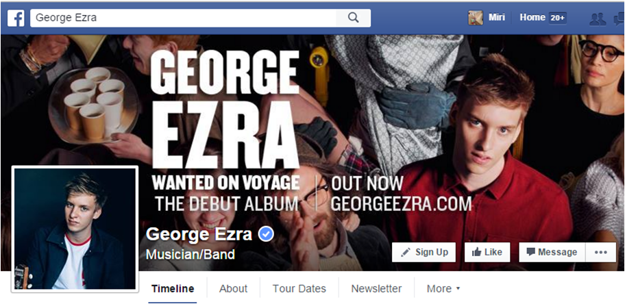
George Ezra's website, digipaks and Facebook all feature the same font which creates a sense of continuity and easy identification for the audience. His Facebook and album digipak also feature the same image which acts as cross-media promotion for the album as well as further helping the identification of the products.
A member of the audience may see the font and know who the artist is as well as possibly some of their songs and the use of the same image allows the audience to become familiar with that product and what George Ezra looks like, therefore aiding their identification of his products.


We decided that like George Ezra, and many other artists. we would use the font and an image to connect our products.
We chose to use the font that appears on the digipak as the font that would appear on the website and other products, just like Ezra did. This was because it would connect the products to ensure that the audience would be able to identify that they were from the same artist and not someone else.
We did not feel as though creating a logo for our artist would work as for indie artists, this is not often done as they would use the font as we have done to identify the artist.
However, we did feel that using the same image on the digipak and Facebook would help connect the products and help as a form of promotion. This was something that we have seen with other artists. By using the cover of the digipak on the Facebook page, we are ensuring that the audience is aware of its release and therefore encouraging them to buy it. We used a similar image on the website, changing the colour scheme as this worked better for our website, The image we used is very similar and therefore still allows the audience to connect the products and recognise Harper.


GROUP TASK
1. What does your artist, Jay Harper, stand
for?
 Jay is one of those people who is a
reformer. He’s isn’t materialistic. He cares about good music and he represents
it well. Unfortunately the world has become very mainstream, where money and
status is valued over individualism. Basically, Jay stands for all of those who
have taste.
Jay is one of those people who is a
reformer. He’s isn’t materialistic. He cares about good music and he represents
it well. Unfortunately the world has become very mainstream, where money and
status is valued over individualism. Basically, Jay stands for all of those who
have taste.
Jay Harper is about commitment as he
committed to learning to play the guitar and becoming good at it. He tried to
make it in the music industry as an indie artist which today in the music
industry is something that is very difficult to do.
He also stands to being yourself and
expressing yourself in a way that suits you. Jay’s appearance is not what is
important to him, and instead of expressing himself through fashion, he expresses
himself in song. Jay Harper is always himself, if you like his personality and
his music, that’s great but he won’t change just to fit in with mainstream
culture.

2. What other artists are similar to your
artist and how have you influenced from them?
We’ve noticed similarities between Jay and
artists like Hozier, Tom Odell and George Ezra. Their popularity and
representation of the indie genre has proven that we needed to showcase Jay’s
musical talent by displaying his guitar abilities as often as possible.
 Jay Harper is similar to other indie
artists like Tom Odell, Hozier and Jack Garratt. Like these artists, we saw
that the use of musical instruments was key to creating an authentic indie
artist. As a result, we made it so that the guitar was present in all of the
products we created to emphasise the natural talent of our artist.
Jay Harper is similar to other indie
artists like Tom Odell, Hozier and Jack Garratt. Like these artists, we saw
that the use of musical instruments was key to creating an authentic indie
artist. As a result, we made it so that the guitar was present in all of the
products we created to emphasise the natural talent of our artist.  We were also inspired by the style of these
artists, shaping Harper’s fashion style in a similar way. We looked at how
these artists created a laid back, relaxed image through the clothes they wore.
They also presented a casual image, suggesting to us that their image and
appearance is not the most important thing in their success. We wanted to
create an image true to the indie genre which meant conforming to this style and
the way that these artists dressed in order to help create an effective star
image.
We were also inspired by the style of these
artists, shaping Harper’s fashion style in a similar way. We looked at how
these artists created a laid back, relaxed image through the clothes they wore.
They also presented a casual image, suggesting to us that their image and
appearance is not the most important thing in their success. We wanted to
create an image true to the indie genre which meant conforming to this style and
the way that these artists dressed in order to help create an effective star
image.
3. What are the key aspects of Jay’s star
image and what do these stand for?
Well, Jay relies on authenticity which is
the main connotation of his star image. As has already been said, he plays his
guitar as much as he can, showing that he is so much more organic than others
in the industry.
 We also don’t style him. He chooses his own
clothes and decides what to do with his hair and I think that’s important as
the audience can see him for him. It’s casual, but Jay’s got a good sense of
style.
We also don’t style him. He chooses his own
clothes and decides what to do with his hair and I think that’s important as
the audience can see him for him. It’s casual, but Jay’s got a good sense of
style.
Jay is someone who truly cares about the
music he produces, wanting to make it about real life problems and first hand
experiences. His music is what’s really important, he wants to be successful on
the merit of his music, not the image that has been created for him.
The thing about Jay is that it’s not all
about image with him. He’s got natural talent. He doesn’t need anything to hide
behind. Jay is just Jay, that’s all there is to him, he doesn’t hide anything.
4. In relation to Jay’s target audience, what
would you say the genre of his music is and how does it appeal to his target
audience?
Jay’s target audience is probably around
the young adult mark. Maybe 15 to 30? They’d be students or casual workers so
they could possibly be seeking independence. Jay’s indie style of music gives
us something that people can relate to without being over-crowded with common
pop devices like autotune. We know that he’s real and not constructed, so he
can help people be independent through his music as he’s being completely
honest.
5. What is it about your artist that makes him
unique?
Our artist is unique; this is because Jay
shows his own personality and also has a narrative based and performance which
is different to other artists. Jay is indie yet also has a rock twist which
makes him different. Jay is organic and has a unique selling point. This unique
selling point is shown through his voice and guitar and story line. The artists
dress sense is simple which again makes him stand out because he is an ordinary
person who is looking for love and also an aspiring artist.
Our artist is unique because unlike artists
like George Ezra, Hozier and Ben Howard, he is fairly young. This means that he
is able to attract and appeal to a younger target audience. This is unusual for
indie artists who often find it very difficult to sign to a label and become
successful, performing in pubs and busking instead. The fact that he is young
means that he can produce indie music which appeals to the younger audience and
it about life as a young person.
6. What is the meaning of Jay’s star image and
how does it appeal to his target audience?
The star image does appeal to the target
audience, this is because the target audience when doing our survey monkey
discussed whether our artist liked the concept.
From this the star image clearly appealed to the target audience of
teenagers roughly 15-30. This age range discussed how they like artist who are
unique and also liked the indie style and artists such as James Bay, Tom Odell
and George Ezra.
The people in the survey monkey in our
target audience liked the songs which come from a similar genre and style
image. The target audience also liked the organic aspect of Jay Harper and
therefore the deep planning to help make the artist stand out.
Jay’s image stands for authenticity,
honesty , being true to yourself and working hard which would appeal to our
target audience as it would encourage them to try their best and work hard while
staying true to who they are by being honest and open. This is something that
young people in today’s society struggle to do and something that Jay’s image
hopefully encourages in young people by showing them what hard work and not
changing because society wants you to can achieve.
7.
How did
you show the on screen chemistry in the music video for ‘Best Fake Smile’?
The on screen chemistry in the music video
is shown through camera angles. This was shown by having angles such as close
up of the couple’s face together smiling. Other shots include wide angle shots
of them on logs together and close ups of them holding hands.
 The music video also shows the chivalry
between the couple by close ups of the couple jumping over a gate and high
angle shots of them having a picnic. This on screen chemistry is important for
the music video and the planning of location helped compliment the camera
angles to look more realistic on a date and interesting.
The music video also shows the chivalry
between the couple by close ups of the couple jumping over a gate and high
angle shots of them having a picnic. This on screen chemistry is important for
the music video and the planning of location helped compliment the camera
angles to look more realistic on a date and interesting.
We also used shots of the couple which
seemed the most natural and were also often caught by chance and where we had
given directions but the outcome was unplanned which helped us to show natural
chemistry, making it more believable and less contrived.
8. How does Jay’s website, digipak and music
video work together to reinforce his star’s image and sell your artist?
 The authenticity is shown throughout the
products through the use of the guitar and idea of performance. This is a very
important aspect of Jay’s star image and is something that we felt needed to be
addressed and enforced in all aspects of Jay’s promotion. If this was not done,
Jay’s image would not be used effectively to sell him as an artist.
The authenticity is shown throughout the
products through the use of the guitar and idea of performance. This is a very
important aspect of Jay’s star image and is something that we felt needed to be
addressed and enforced in all aspects of Jay’s promotion. If this was not done,
Jay’s image would not be used effectively to sell him as an artist.
The website and digipak and music vid
 eo all
have a similar theme. This is because in the music video within the performance
element the artist is in the studio singing. This camera shot is reflected in
the digipak with the studio and lighting, the studio lighting image is also on
the Website and social media sites. This similar style colouring and studio is
shown throughout Jay Harpers image and style. This is important when selling
Jay harpers image to the target audience and public. This is because the colour
purpley/reddish is a colour that is shown across the 3 platforms. This is
important for recognition for the artist overall which allows the artist to be
successful!
eo all
have a similar theme. This is because in the music video within the performance
element the artist is in the studio singing. This camera shot is reflected in
the digipak with the studio and lighting, the studio lighting image is also on
the Website and social media sites. This similar style colouring and studio is
shown throughout Jay Harpers image and style. This is important when selling
Jay harpers image to the target audience and public. This is because the colour
purpley/reddish is a colour that is shown across the 3 platforms. This is
important for recognition for the artist overall which allows the artist to be
successful!
In all of the images, Jay wears similar
clothing; this is done to reinforce his casual style. The clothing worn is
important in creating the idea that he is an average person. By having similar
clothing worn throughout, Jay gives the impression that he really does dress
like this and didn’t dress up particularly for one aspect of his promotion.


