Sunday, 27 December 2015

Magazine Cover

In order to connect with fans, music artists often do interviews and appear on the cover of magazines, particularly music magazines. I have looked at the covers of several different music magazines for indie music as well as general music magazines and designed this cover.

I chose to use this specific image of Jay Harper as it gives the readers a clear picture of what he looks like. Additionally, in this image, he looks quite serious which is a common quality of indie artist as they are focused on their music and take it seriously. I positioned this image in the center of the cover as it makes it the focal point, drawing the reader's attention to it and therefore to the artist. 
     'Jay Harper' is written in bigger font than other wording on the cover as this once again draws attention to it as well as what is written underneath. The quote is from the interview with Harper which will appear inside the magazine. It reads 'it's hard to believe that just three years ago I was busking by my local shopping centre'. This is something that can be used to connect with fans as it gives them a backstory to buy into and something that they may be able to relate to having either witnessed busking themselves or having taken part in it. It also connotes that like an indie artist Harper has worked hard to achieve success rather than just being given it.

Saturday, 19 December 2015

Creating Jay Harper's Facebook Page

Mike Masnic speaks about the importance of an artist connecting with fans. Social media is a good way to connect with like-minded people as well as spread the word, so, I created a Facebook page for Jay Harper. Through this, Jay Harper can post updates and other Facebook users can share his page to help build his fanbase, because, as Henry Jenkins states 'if it doesn't spread it's dead' signifying the importance of creating something which can easily spread.
     The cover photo for the page is the image from the front of the digipak as this will re-enforce the image and therefore encourage people to buy the album. It is also something that the target audience may recognise. Additionally, to create the profile picture, I edited a picture of Jay with his guitar to put it onto a wooden background. This was important because the guitar connotes that he is an organic indie artist as well as the use of the wood in the background.
     On the page, there is an 'about' tab which has a biography for Jay, details of his management and bookings as well as a link to the official website. The link to the website is very important because it encourages the audience to connect and interact with Jay using a different site which they can use to explore what he does in more detail as well as sign up for newsletters.

Wednesday, 16 December 2015

Changes to the Digipak

We put the digipak onto one template to see what it would look like and then we printed it out and put it in a empty CD case to see what the final product could look like. This was beneficial as it allowed us to check the dimensions, and as a result, we saw that some of the sides needed to be made larger so that they would fit properly. Additionally, since our first draft, we realised that we were not making a single, but rather an album so we had added in some more songs on the track list.


   Another change we have made since the last draft of our digipak is related to the font. After conducting more research into different fonts, we decided to change the font again to a more basic one which still had a vintage appearance and therefore connoted Jay's authenticity. The new font also looks a lot more professional and therefore makes our digipak look like a real media product.
Furthermore, we moved the thank you message to the corner of the inside cover as we did not think it needed to be as big. We also looked at other things which should feature on a digipak such as song credits and put these into the inside cover.
     A third thing we added was a picture of Jay with his guitar on the inside cover. This was done to reinforce his authenticity and the fact that he has other talents than just singing. This is was something that we felt was very important in the construction of Jay's organic, indie star image and so was something we wanted to incorporate wherever possible. 

Changing our Font

We have decided to change our font as we now feel that we have found a better one which is more inline with what we have seen used for indie artists like Tom Odell and George Ezra.
     We decided to use it because it had a vintage appeal to it that would therefore connote authenticity and Jay's organic nature. It is also quite simple, something we realised was important after looking at fonts for similar artists. I also feel that this font is recognisable and stands out on all of our products and therefore can be used by the audience to easily link the products.

Sunday, 13 December 2015

Mike Masnic - Connect with Fans and Reasons to Buy

Mike Masnic says that it is important for an artist to connect with fans (CwF) and give them a reason to buy (RtB), rather than forcing them to pay. This is similar to Amanda Palmer who asks her fans for help, instead of making it so that her fans had no other choice but to pay. Masnic says that CwF and RtB helps create a new business model for artist in the music industry helping them to bypass it.
     Masnic also talks about there being more content, opportunity and access than ever before and that the music industry is not just the recording industry but rather all other aspects that go into an artist. This is because while people are spending less money of CDs, they are spending more on other aspects such as going to live shows and merchandise. Masnic emphasises that it is still important to CwF and give them a RtB these other products provided for them.
     The fact that there is more content available than ever due to bedroom producing, means that not everyone makes money from the production of music, signifying how important it is to provide the fans with a reason to buy, making them want to buy rather than feel like they are being forced to.

HOW CAN OUR ARTIST CONNECT WITH FANS

Connecting with fans is simple to do with the increasing availability of social media. Jay Harper has a Facebook page, Instagram, Twitter, and YouTube account and the links to these are found on his official website.
    Harper will post on Facebook, Instagram and Twitter accounts, talking about what he has been up to and replying to fans. This is important as it means that he is directly connecting with the fans on a personal level, giving them a reason to buy as they have a more personal and intimate connection.
     On his YouTube channel, Jay Harper's latest music videos will be uploaded, however, he will also post vlogs in which he will give the fans an insight into his day to day life. This is something that George Ezra had done with things like 'George Ezra - The Story of the Ezra Express' and like the Vevo Lift Series which gives fans an insight into the life of the artist which may even include a question and answer session.
     Often artists send out a newsletter in order to keep their fans up to date a release official information, and sometimes, they even name the recipient. Jay Harper sends out monthly emails in which he summarises what the has been up to that month.
     Having a fanmail account is another way of connecting with fans as it will allow fans to email Jay Harper directly and therefore create a unique personal connection between that particular fan and Jay, something which will be different for each individual artist.

WHY WILL THIS GIVE THE FANS A REASON TO BUY

This will give Jay's fans a reason to buy because they feel like they have a more personal and intimate connection with him, encouraging them to spend money as they feel like they know the artist.
     Additionally, by giving the fans constant updates, the set pattern of album, tour, break is broken. This is because the internet has allowed for these constant updates. If fans are not updated about what the artist is doing, they have less incentive to buy because they will lose interest. Constantly updating the fans is a way of maintaining the connection with them and therefore maintaining their interest in the artist, giving them a reason to buy.

Group Messages

When working on our website, I used iMessage to talk to another member of my group to discuss the background possibilities. We also spoke about how we could get our artist to connect with his fans and decided that we could make an instagram account as well as Facebook and other social media accounts. I found this a very useful way of speaking to those in my group and making sure we were all on the same page about the next step in the project.


Inside of the Digipak

This is the inside of our digipak. We designed the Thank You message after looking at how this was done on other digipak and used the same image for the disc as the front cover in order to create a sense of continuity.

Saturday, 12 December 2015

Music Magazines

Powered by emaze

Our Music Video Linked to Various Narrative Theories

Merchandise for the Website

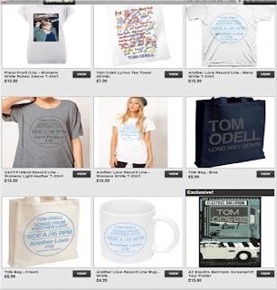
Another stream of revenue for artists is merchandise which fans can buy through the artist's website. Artists make and sell merchandise because in music in the online age, they are receiving less money from single sales and music sales due to the emergence of streaming so need to find other ways of making money. Merchandise is a good way of doing this because it can enable fans to outwardly show their support for the artist and the merchandise may not cost that much to produce.

 In order to understand what merchandise we should put on our website, I have looked at what merchandise Hozier, Tom Odell and Ben Howard sell.


Common things sold alongside music included t-shirts, hats, posters and mugs. These items are very simple, with only a picture of the artist or the album cover and maybe the artists name. They also use colours which are not particularly bright. This is important in helping present their star image as the simplicity of these items highlights the simplicity of the indie artist and the lack of bright colours and basic design helps to connote their organic nature. 
When creating the merchandise for Jay Harper, we should consider the type of product we are going to sell, keeping them basic. We should also ensure that the design is simple and that we use simple colours. This will all help to not only connect with our fans and bring in another stream of revenue but also may help to enforce our star image through the presentation of these products.

Thursday, 10 December 2015

Writing the Message for the Inside Cover

To understand what the inside sleeve of a digipak should include, I looked at the sleeve for Tom Odell's album 'Long Way Down'.
After looking at this, another member of the group along with myself created this one for our album.

Outside of the Digipak

We decided to use this image for our digipak.

We chose this cover because we felt this would best connote that our artist is an organic, indie artist. This is due to the images of Jay which are used as the use of the guitar adds to his authenticity and the profile on the front is an alternative angle and shows Jay in mid-song again highlighting his authenticity. 
    We chose this font because we felt it was appropriate appropriate for an indie artist as it has a hand written appearance, conforming to the DIY nature and attitude of indie artists. It is also bold and easily stands out and would be very recognizable. 

Wednesday, 9 December 2015

Possible Digipak Images

It was very difficult to decide on the front and back covers of the digipak as each member of the group thought of different ideas. As a result of this, we ended up designing a few images which could have been used for this, mainly the front.

Fonts for the Album Cover and Wesite

We looked at various different fonts which could be used. It was important that the font looks good on both the album cover and the website because from our previous research, we have noticed that it is important for consistency and it also applies to the Richard Dyer's star image as it makes the artist's products recognisable.

This was the one of the fonts we used for our website, digipak and merchandise. However, I thought that it was too feminine to represent our artist. We also tried to put this font in an aqua blue font which again was too feminine for our artist.
The second font we tested for our artist and although it was better than the first, we went on to find a third font which we preferred and wanted to use.  This is the font that we wish to use for our artist as we feel that the DIY, painted appearance has indie connotations and signifies authenticity, something we want our artist to symbolise.

Tuesday, 8 December 2015

How to Get the Vintage Effect

We have decided that we want to try to add a vintage effect of our footage as this may help make the narrative clearer as well as make our artist seem more organic as the colouring will look older and therefore connote that our artist is natural. The vintage effect removes the bright colour to give the footage an ageing effect.

In his video for the song 'Photograph', Ed Sheeran uses old footage which already has a vintage look to it, however, this does make him seem more organic and natural.

Another example of a music video which uses the vintage effect is Ben Howard's 'Old Pine'. This makes the video look older and makes Howard seem like a more organic artist as it highlights the natural colours and therefore makes him seem natural.

In order to try this out on our own video, we need to know how do it, therefore, I have looked at some tutorials on the internet to give me an idea of how to do this. I looked a range of sources including YouTube videos as well as articles on blogs.


Applying Carol Vernallis's Theory to My Music Video

WHAT IS INCLUDED IN THIS THEORY?

  • The use of jump cuts to speed up time
  • Narrative is not complete but is suggestive of an idea
  • Camera movement can give the illusion of an edit even if there isn't one
  • The fourth wall is broken
HOW HAVE I APPLIED TO THIS?
  • There are several jump cuts both between narrative stands and within them.This allowed us to show a variety of different activities quickly and helped us maximize the length of the song. Within the length of the song, this meant that we had more time to show more footage and connote the narrative to the audience.
  • All of the narrative threads in the video are not complete as this leaves it open for the audience to interpret what they have seen. Despite this, the narrative is clear enough to give the audience an indication to what is going on and therefore, they can understand it.
  • Sometimes, we moved the camera which gave the illusion that we had cut between shots, when in reality, we had continued filming in a different place.